
Parko
One Connected Flow, From Search to Parked
- Product
- Parko — Smart Parking Mobile App
- Role
- UI/UX Design
- Platform
- iOS-style Mobile App
- Category
- Smart Parking / Mobility
- Theme
- Dark + Orange
- Core Modules
- Onboarding, Authentication, Home Discovery, Detail Pages, Navigation, Slot Selection, Ticketing, Booking Management
Overview
A Single Digital Touchpoint for Parking, Start to Finish
Parko is a smart parking mobile application designed to help drivers discover nearby parking areas, review parking details, navigate to the selected location, reserve a slot, and manage bookings in one connected flow.
The application focuses on reducing parking stress through a dark premium interface, strong visual clarity, and task-oriented user journeys.
The Parko experience was designed to solve an everyday urban problem: parking friction. Drivers often lose time searching for an available space, comparing options manually, confirming trust, and navigating through unfamiliar areas. Parko brings these disconnected tasks together in a unified mobile experience — from quick access to parking information through to a digital QR ticket and confident, integrated navigation to the destination.
The Context
Turning a High-Friction Real-World Task Into One Digital Touchpoint
Parking is a high-friction real-world task. In busy commercial and urban areas, drivers commonly face uncertainty related to space availability, pricing, safety, location access, and booking confirmation — made worse when information is scattered across multiple channels or the user must physically explore several locations before deciding.
Parking providers need a digital way to present availability and facilities. Drivers need confidence before committing to a booking, immediate and understandable navigation to the selected space, and booking records that remain accessible after purchase for review, cancellation, or re-use.
The product vision: a reliable, easy-to-understand, and visually premium mobile parking experience that helps users move from discovery to confirmed booking with minimal cognitive effort.
The Problem
Trust and Clarity, Without Slowing the Driver Down
The website had to feel
But it also had to remain
How might we make a premium, dark-themed parking experience feel immediate and trustworthy without slowing a driver down?
Business Objectives
Fast Nearby Discovery
Help users find nearby parking spaces quickly.
Confident Decisions
Provide enough information for users to make confident decisions.
Smooth Reservation
Enable smooth slot reservation and booking confirmation.
Seamless Navigation
Support a seamless navigation experience to the chosen parking area.
Central Booking Control
Allow users to review and manage booking status from a central dashboard.
User Goals
- Know which parking place is worth choosing
- See transparent pricing and visible position/slot details
- Navigate easily from current location to the destination
- Verify access clearly after booking
- Monitor and manage booking states
Target Audience
Commuters
Commuters looking for quick parking near offices or transit points.
Needs
- Transparent pricing
- Easy navigation
- Fast decisions
Shoppers
Shoppers visiting malls and commercial areas.
Needs
- Trustworthy facility details
- Clear position/slot information
Event Attendees
Event attendees seeking structured access to nearby parking.
Needs
- Structured booking
- Reliable confirmation
Drivers in Unfamiliar Areas
Drivers in unfamiliar areas who require reliable guidance.
Needs
- Clear navigation
- Route confidence
Convenience-Focused Drivers
Users who value time savings, safety, and convenience.
Needs
- Booking status control
- Minimal friction
Proto-Personas
Busy City Driver
- Goal
- Search nearby options, compare them quickly, and secure a spot without spending extra time on manual parking discovery.
- Motivation
- Save time and reduce stress
- Pain Point
- Uncertainty about availability and safety
Needs
- — Fast booking
- — Reliable navigation
Mall or Event Visitor
- Goal
- Evaluate parking options based on distance, price, and convenience before arriving.
- Motivation
- Convenience and trust
- Pain Point
- Confusing parking layouts and crowded destinations
Needs
- — Clear reviews
- — Facilities
- — Confirmation details
Key User Pain Points
“Difficulty finding available parking nearby.”
A home discovery screen built around current location, quick search, and transportation-based entry points.
“Lack of trust before selecting a parking location.”
A detail page with facilities, description, pricing, and trust signals — 24/7, CCTV, security, emergency services.
“Unclear visibility of facility features and service quality.”
A dedicated Review tab with rating filters and visible user reviews.
“No connected system for booking, ticketing, and navigation.”
A digital QR ticket whose Start Navigation CTA connects booking directly to movement.
“Weak visibility over active, upcoming, or cancelled bookings.”
A My Booking dashboard with All / Active / Cancelled state filtering.
UX Strategy
Discover
Search nearby areas and explore transportation-based entry points from the home screen.
Evaluate
Review facility details, pricing, ratings, and reviews before committing.
Reserve
Select floor, sector, and slot, then confirm the booking.
Navigate
Follow a simplified route to the reserved parking space.
Validate
Scan the digital QR ticket on arrival for entry.
Manage
Track active, upcoming, and cancelled bookings from a central dashboard.
Information Architecture
Splash
Onboarding
Authentication
Home / Discovery
Parking Detail
- About
- Review
Navigation
Select Space
- Floor
- Sector
- Slot
Digital Ticket
My Booking
- All Booking
- Active
- Cancelled
Profile
User Flows
End-to-End Journey
Content Architecture
- Splash
- What does this brand feel like?
- Onboarding
- Why should I care?
- Login
- How do I get in quickly?
- Home
- Where do I start?
- Parking Detail
- Can I trust this space?
- Navigation
- How do I get there?
- Select Space
- Which slot is mine?
- Digital Ticket
- How do I get in?
- My Booking
- What's the status of my bookings?
Research Direction
Assumed research questions
- — What information is essential before a user trusts a parking place?
- — How much context should be visible on the detail screen before booking?
- — How can navigation feel immediate without overwhelming the user?
- — Which booking states matter most after confirmation?
- — How can a dark premium visual style remain readable and accessible?
Likely findings applied in design
- — Users need clear distance and pricing information immediately.
- — Trust signals such as facilities, reviews, and safety indicators matter before booking.
- — Navigation must emphasize route clarity over map complexity.
- — After booking, users want simple access to status, time, and slot details.
- — Strong visual hierarchy is critical in a dark interface.
Competitive Thinking
Products in mapping, mobility, and booking categories commonly succeed when they minimize friction and present fast decision support. Parko adopts this principle by combining location-driven discovery, clear component states, and action-oriented CTAs. The design intentionally keeps the interface premium but practical.
Visual Direction
A Dark, Premium Interface Built Around One Accent Color
The interface uses a dark theme to support premium perception and focus, with orange as the primary action and attention color. White and gray values carry readability and information hierarchy, key actions are given strong button hierarchy, and every screen is kept to a single dominant purpose to avoid clutter.
Color Palette
Brand 50
#FCEEE3
Primary actions, highlights, selected states
Brand 100
#FBEADC
Primary actions, highlights, selected states
Brand 200
#FAE5D3
Primary actions, highlights, selected states
Brand 300
#F9DFC8
Primary actions, highlights, selected states
Brand 400
#F7D7BA
Primary actions, highlights, selected states
Brand 500
#F5CDA9
Primary actions, highlights, selected states
Brand 600
#F3C194
Primary actions, highlights, selected states
Brand 700
#F0B279
Primary actions, highlights, selected states
Brand 800
#EC9F58
Primary actions, highlights, selected states
Brand 900
#E7872E
Primary actions, highlights, selected states
Brand 950
#E57B1A
Primary actions, highlights, selected states
Gray 50
#FAFAFA
Text, surfaces, contrast, neutral UI structure
Gray 100
#EFEFEF
Text, surfaces, contrast, neutral UI structure
Gray 200
#DCDCDC
Text, surfaces, contrast, neutral UI structure
Gray 300
#BDBDBD
Text, surfaces, contrast, neutral UI structure
Gray 400
#989898
Text, surfaces, contrast, neutral UI structure
Gray 500
#7C7C7C
Text, surfaces, contrast, neutral UI structure
Gray 600
#656565
Text, surfaces, contrast, neutral UI structure
Gray 700
#525252
Text, surfaces, contrast, neutral UI structure
Gray 800
#383838
Text, surfaces, contrast, neutral UI structure
Gray 900
#161616
Text, surfaces, contrast, neutral UI structure
Gray 950
#000000
Text, surfaces, contrast, neutral UI structure
Error 50
#FDE4E4
Warnings, destructive states, cancelled state
Error 100
#FDDDDD
Warnings, destructive states, cancelled state
Error 200
#FDD4D4
Warnings, destructive states, cancelled state
Error 300
#FDC9C9
Warnings, destructive states, cancelled state
Error 400
#FCBCBC
Warnings, destructive states, cancelled state
Error 500
#FBABAB
Warnings, destructive states, cancelled state
Error 600
#FA9696
Warnings, destructive states, cancelled state
Error 700
#F97C7C
Warnings, destructive states, cancelled state
Error 800
#F75B5B
Warnings, destructive states, cancelled state
Error 900
#F53232
Warnings, destructive states, cancelled state
Error 950
#F41F1F
Warnings, destructive states, cancelled state
Typography
Aa
Titillium Web
Hero moments · Welcome screens · Major headlines · Screen emphasis
Aa
Titillium Web
Primary section titles · Sub-sections · Cards and structured headings · Primary paragraph text · Supportive information · Meta and helper text · Labels, tiny metadata
- Display XL
- 60px · Light / Regular / Semi-bold / Bold
- Display LG
- 48px · Light / Regular / Semi-bold / Bold
- H1
- 36px · Light / Regular / Semi-bold / Bold
- H2
- 30px · Light / Regular / Semi-bold / Bold
- H3
- 24px · Light / Regular / Semi-bold / Bold
- H4
- 20px · Light / Regular / Semi-bold / Bold
- H5
- 18px · Light / Regular / Semi-bold / Bold
- Body 1
- 16px · Light / Regular / Semi-bold / Bold
- Body 2
- 14px · Light / Regular / Semi-bold / Bold
- Body 3
- 12px · Light / Regular / Semi-bold / Bold
- Micro
- 10px · Light / Regular / Semi-bold / Bold
Component System
Iconography
Core components
States
- Primary button
- Solid orange fill, high contrast — e.g. Get Started, Book Now, Continue
- Secondary button
- Outline, tertiary, and ghost variants for supporting actions — e.g. Cancel Booking
- Text link
- Minimal icon and text buttons for tertiary actions
Primary actions should be the most visually dominant.
Destructive or error states should use the red system.
Inputs should remain clean, high-contrast, and easy to scan.
Tabs should support quick filtering and state changes.
Cards should group decision-critical information compactly.
Screen-by-Screen Case Study
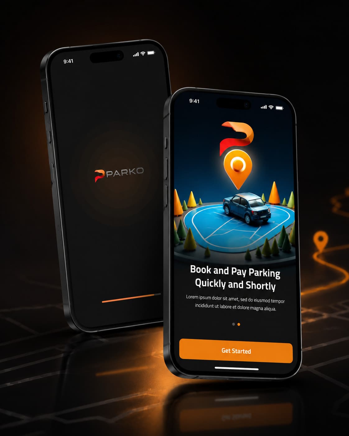
Splash Screen
The splash screen introduces the Parko identity and creates an immediate branded first impression. The minimal composition keeps the user focused on the app mark while a progress indicator suggests transition and system readiness.
- — Purpose: Brand entry point
- — UX Role: Set tone and reduce perceived wait time
- — Visual Direction: Dark background with subtle orange glow
Onboarding Screen
The onboarding screen introduces the core value proposition: quick and easy parking and payment. The illustration-driven layout makes the concept instantly understandable while keeping the CTA obvious.
- — Primary Message: Book and pay parking quickly
- — CTA: Get Started
- — Design Rationale: Focused, minimal, and motivational
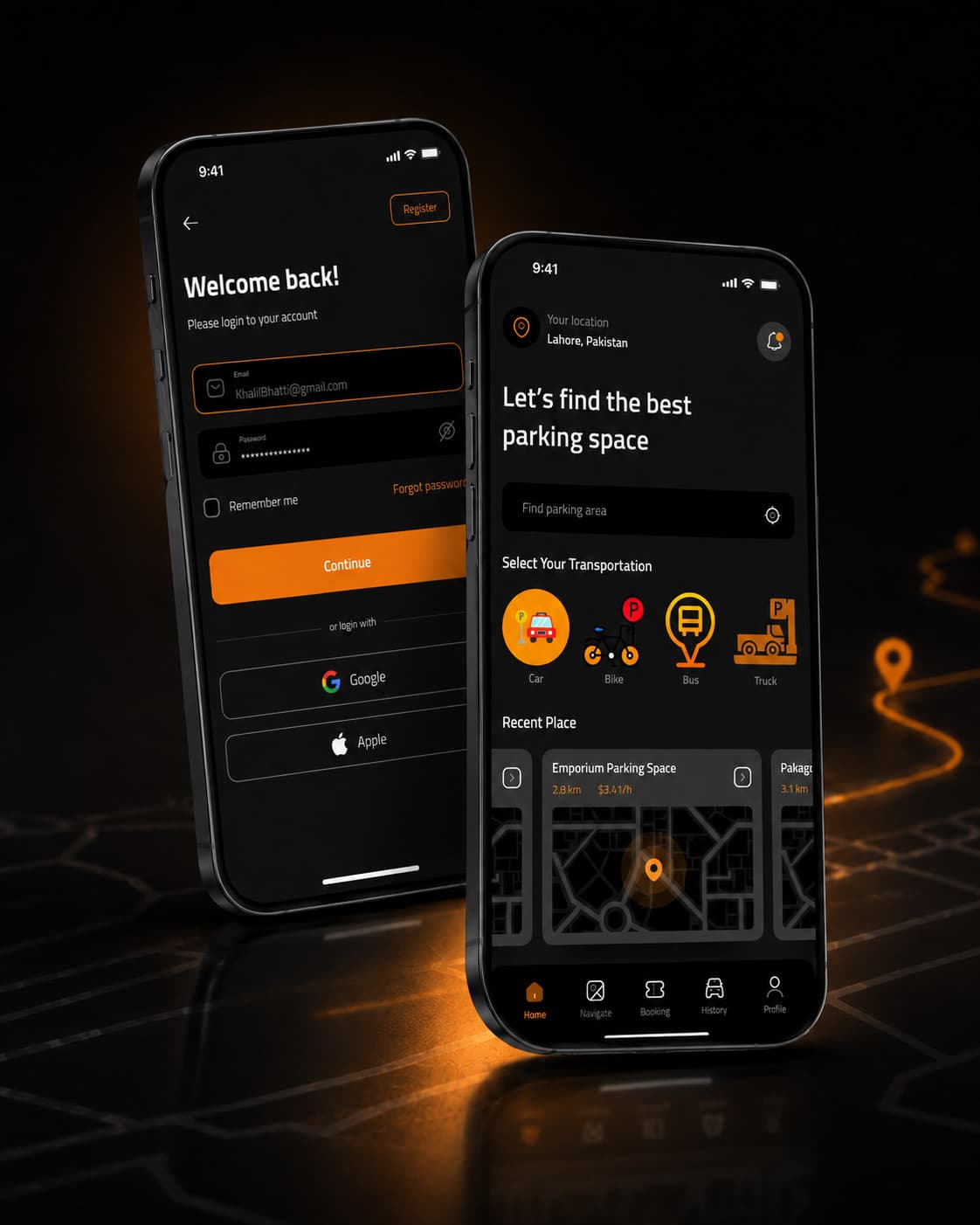
Authentication / Login
The login screen balances brand personality with practical account access. The layout gives strong emphasis to the welcome headline and the Continue CTA while also providing Google and Apple alternatives.
- — Trust Element: Clear structure and familiar social sign-in
- — Usability Element: Remember Me and Forgot Password are easy to locate
- — Visual Element: Orange field outline highlights active attention
Home / Discovery
The home screen acts as the central discovery dashboard. It prioritizes three things: current location, quick search, and transportation-based entry points. Recent places further reduce effort by presenting previously relevant destinations in a card carousel.
- — Top Value: Start finding parking immediately
- — Navigation Support: Bottom navigation keeps primary modules visible
- — Decision Support: Recent place cards mix location context and pricing
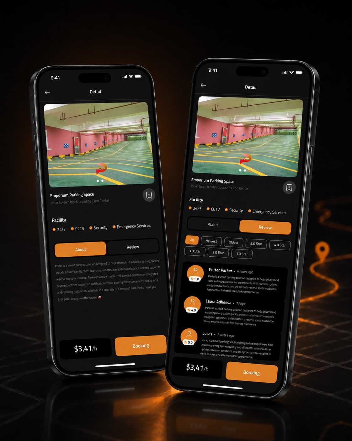
Parking Detail — About
The About tab is focused on clarity and reassurance. A large visual preview helps the user understand the environment, while facilities, supporting description, and pricing explain why the parking place is worth choosing.
- — Trust Signals: 24/7, CCTV, security, emergency services
- — Action Support: Pricing and Booking CTA remain visible
- — Design Benefit: Reduces uncertainty before decision-making
Parking Detail — Review
The Review tab provides social proof. Ratings filters and visible user reviews help the user validate expectations through real feedback.
- — Confidence Builder: Review summaries and user voices
- — Decision Support: Helps compare quality beyond price alone
- — UX Benefit: Makes the booking decision feel safer
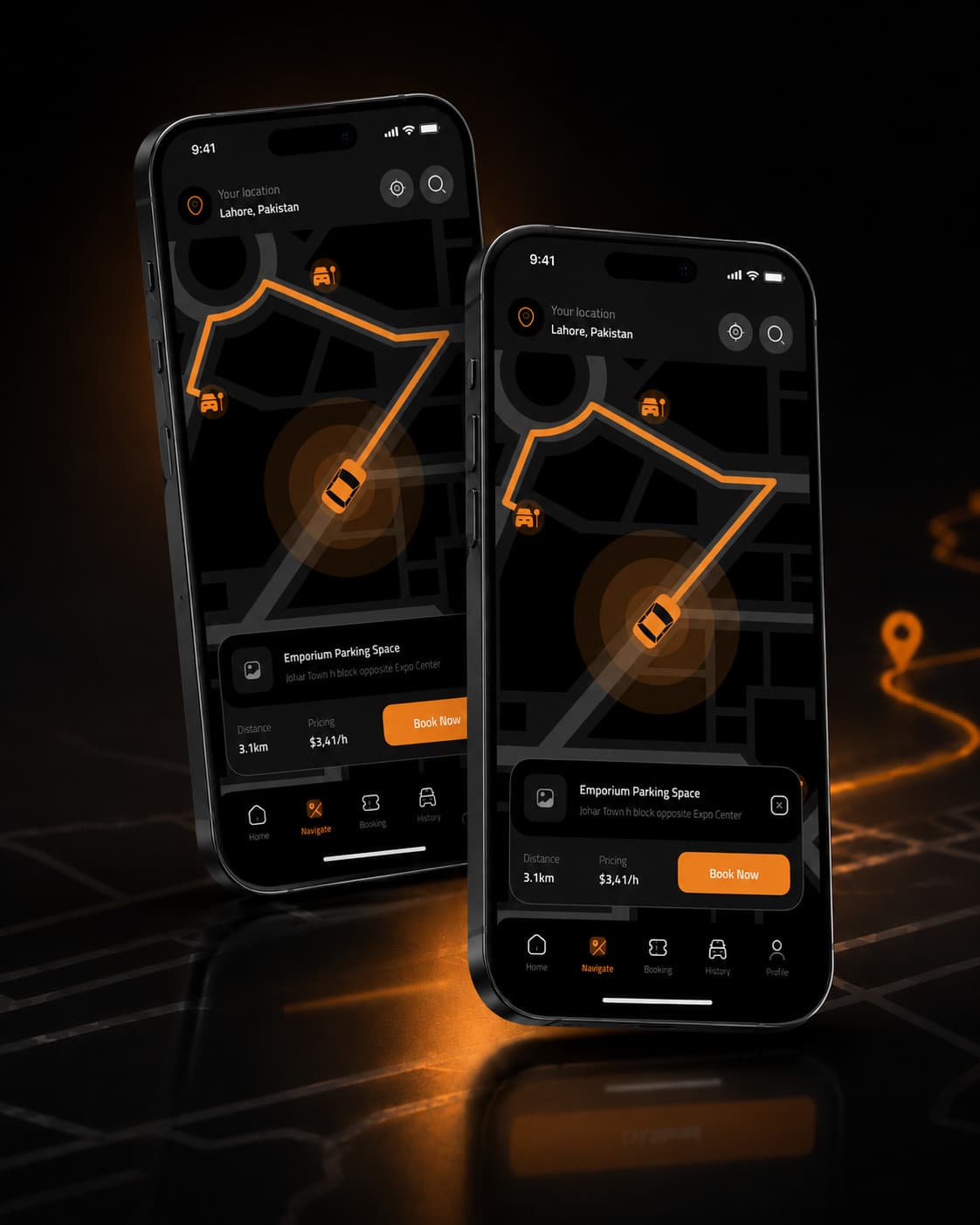
Navigation
The navigation module uses a simplified visual map so the user can focus on route clarity rather than geographic detail overload. Orange path emphasis keeps the route unmistakable. Booking cards remain available as contextual overlays without breaking orientation.
- — Current location remains visible
- — Route emphasis uses the brand accent color
- — Parking markers reinforce destination awareness
- — Contextual cards allow direct action while navigating
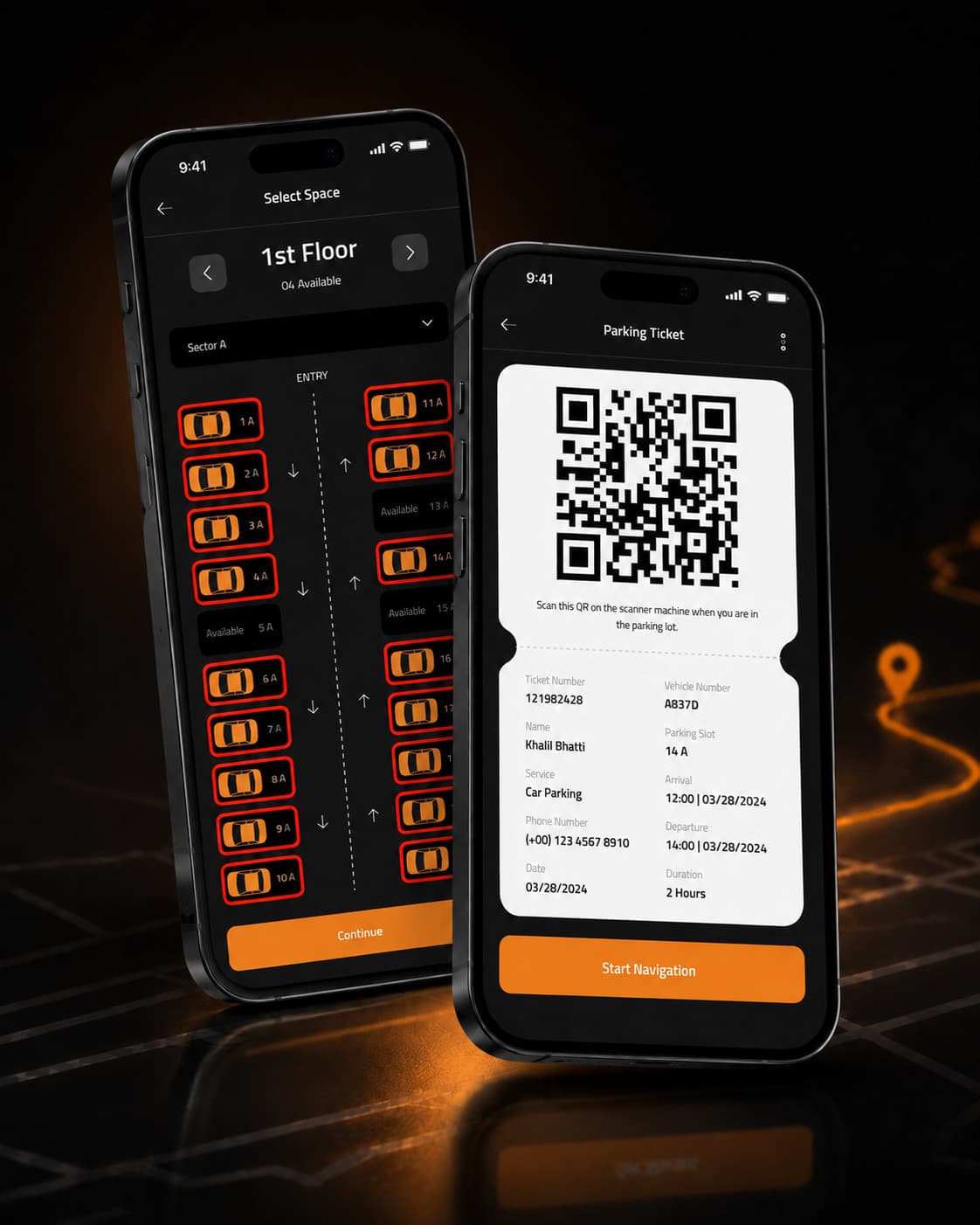
Select Space
The slot selection screen transforms a potentially confusing real-world process into a structured interface. Floor, sector, and slot states are made explicit so users can move from choice to confirmation quickly.
- — Controls: Floor navigation, sector dropdown
- — Visual Logic: Distinct available / unavailable states
- — Action Path: Continue CTA clearly advances the task
Digital Ticket
The digital ticket screen acts as a compact post-booking confirmation asset. It combines scannable access with structured trip and booking data.
- — Key Contents: QR code, booking ID, vehicle number, parking slot, arrival/departure time
- — Operational Role: Helps on-site validation
- — Extended Benefit: Start Navigation CTA connects booking to movement
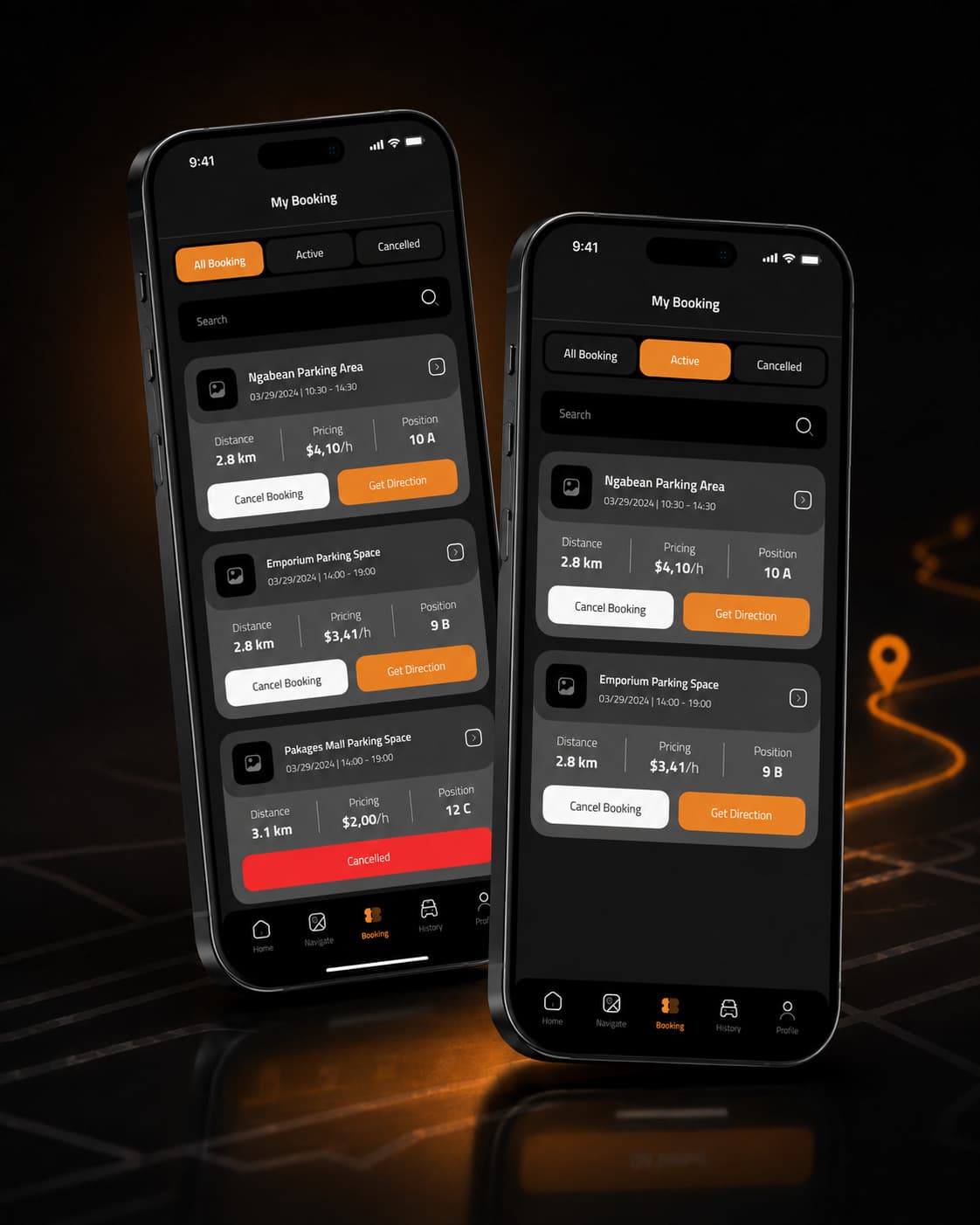
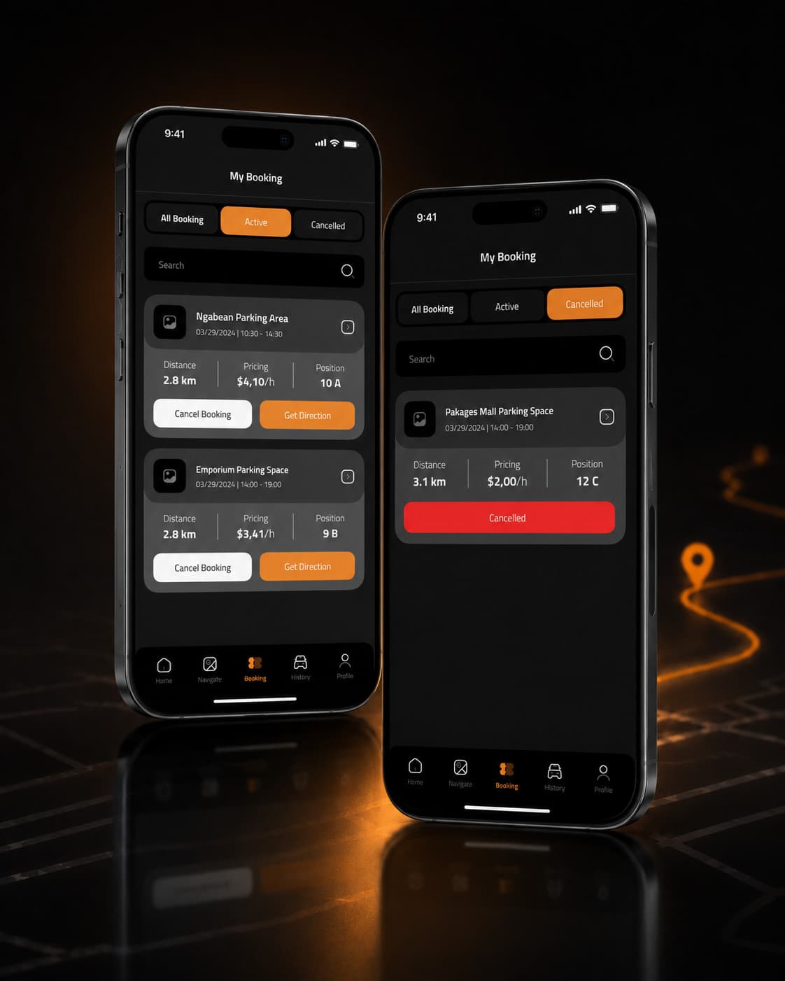
My Booking — Overview / Active / Cancelled
The My Booking section gives the user operational control after reservation. Booking cards present time, pricing, position, and status in a compact format. State filtering through All Booking, Active, and Cancelled tabs improves clarity and reduces information overload.
- — Overview: Central place to monitor all bookings
- — Active: Encourages direct action through Get Direction
- — Cancelled: Uses red destructive color for immediate recognition
The Process
Choose Floor
Navigate between floors to find available space.
Select Sector
Choose the sector from a dropdown list.
Pick Slot
Real-time slot status supports a quick decision.
Continue
A clear, prominent CTA advances the task.
Receive Ticket
A scannable digital ticket confirms the booking.
Interaction Design
Clear, immediate feedback on every state change builds confidence without slowing the driver down.
Accessibility
Conversion Strategy
Booking is the one dominant conversion action across the app — Get Started, Book Now, Booking, and Continue recur as the primary CTA at every key decision point.
Key Design Decisions
Why a Dark Theme?
Matches a premium, technology-forward brand tone, helps the orange accent stand out clearly, and supports a focused, immersive mobile experience.
Why Orange as the Accent?
Warm, energetic, and highly visible — supports strong CTA emphasis and works well with mobility and navigation metaphors.
Why Large Cards and Rounded Components?
Improves touch comfort on mobile, makes clustered information easier to digest, and creates a friendlier, more modern interface.
The Full Site
Mockup Pairing Guide
Challenges
Too much information before booking
Separated detail into About and Review tabs.
Outcome Cleaner decision-making flow
Navigation can become visually cluttered
Used simplified route emphasis and limited overlays.
Outcome Better clarity while moving
Parking slot selection can be confusing
Created floor/sector/slot hierarchy.
Outcome Faster and clearer reservation flow
Users need trust before booking
Added facilities, reviews, pricing, and clear visuals.
Outcome Higher confidence
Post-booking management is often weak
Created filtered booking states and ticket module.
Outcome Stronger end-to-end experience
Project Outcome
Skills Demonstrated
Key Learnings
- Trust in mobility products depends on clarity as much as utility.
- Users make faster decisions when information is grouped and prioritized well.
- A strong component system speeds design consistency and reduces confusion.
- Navigation experiences work best when the route is visually dominant.
- Booking management should be treated as an active product area, not an afterthought.
Future Improvements
Final Reflection
Clarity, Trust, and Speed
Parko is a complete smart parking concept built around clarity, trust, and speed. The design system, task flows, and screen architecture work together to create a smooth user journey from brand entry to post-booking management.
By combining strong visual identity with practical mobility-oriented UX thinking, the product delivers a premium yet usable parking experience.